The campaign seeks to emphasise the close and natural ties to the region where the wine is produced, as well as to its values, culture and identity by using a contemporary and timeless graphic approach.
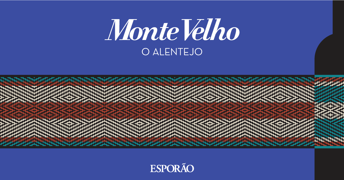
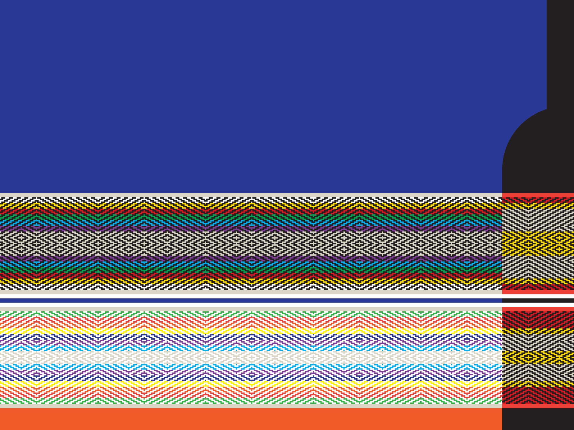
The brand’s association with the Alentejo is closely linked to the origins of Monte Velho, created in 1990 according to the region’s winegrowing tradition, the variety of grapes and vinification techniques that demonstrate the character of the region from whence it comes: rich aromas, a smooth palate and an excellent gastronomic bent.
The concept is based on a graphic encapsulation of a strong message, on the cornerstones of people, landscape and that which is intrinsically part of the Alentejo via unusual language which is very much of the place itself.
For example, when interpreting ‘remoteness’ as a very important feature of the Alentejo, by the use of flat chromatic surfaces – the combination of two warm colours, orange and red, with a tree – that same world is recreated. Or the integration of what is a very condensed representation of the Alentejo rug, which is also ‘reflected’ in the (ever-present) bottle, obeying this ‘grammar’ of flat chromatic surfaces. Here, there is interplay, a visual language that uses flat chromatic codes while lending a certain depth, giving the idea that the rug traverses the surface but goes around the bottle.
‘White Studio’ has created a campaign with a very universal language that is simple and straightforward, one that allows the recreation of concepts and messages that are the essence of the Alentejo.
Based in Porto, with offices in London and Santiago, ‘White Studio’ is a multidisciplinary design studio with over two decades of experience. Find out more about it, here.